Work National Museum of Australia
National Museum of Australia · Arts and cultureFive thousand pages, one front door to the nation’s story
The National Museum of Australia holds more than 200,000 objects and tells the stories behind them, from Defining Moments to the audio series its curators record. In 2017 it asked Ladoo to rebuild nma.gov.au: a new design, a new structure and a migration of everything worth keeping, with the first stage live by the end of June 2018. It went live on time, and Ladoo has looked after its search ever since.
- 5,084 pages in scope moved by script and by hand in eight reviewed batches
- Live in June 2018, eight months from kick-off, on a design framework still in use
- Site search on Elasticsearch, run by Ladoo every year since
A national collection behind a decade-old website
The Museum’s website had grown the way museum websites do. Every exhibition, every online feature and every education program had added a section, often with its own templates, until the site was thousands of pages deep and most of it looked like the year it was made. It was not responsive, and visitors had moved to the phone. The brief asked for a contemporary and striking design, navigation that let people find things and explore, a flexible way to publish in future, and a clear-eyed rationalisation of the content based on what people actually visited.
The Museum split the work in two. Stage one was the core site: the home page, what’s on, visit, exhibitions, the collection, education, Defining Moments, search, and the migration, by 30 June 2018. Stage two would follow with the deeper content types, the shop and library, the blog and the integrations. Ladoo proposed for stage one, won it, and went on to deliver stage two and the years after it.
People planning a day in Canberra
Families, tourists and school groups who want to know what is on, what it costs, how to get there and whether the café is open. They arrive on phones, often on the day, and the old site made them work for every answer.
- What’s on, with exhibitions and events in one calendar
- A visit section that answers the practical questions first
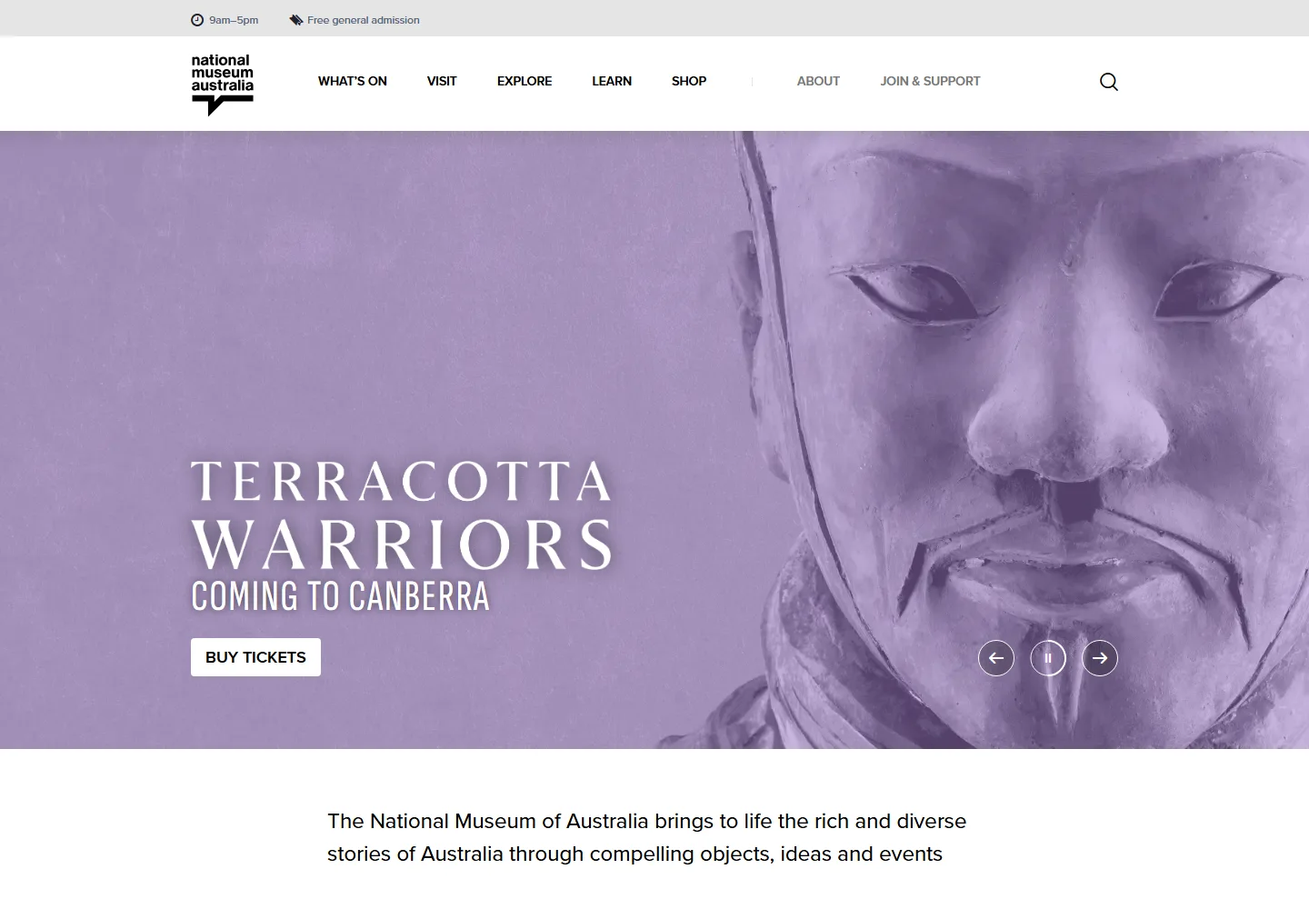
- Opening hours and free admission in the header of every page
Students, teachers, researchers and the curious
Most of the site’s traffic never comes to Canberra. It comes for Defining Moments, for the collection highlights, for an audio lecture or a story, and it comes from a search engine. These pages are the Museum’s reach beyond the building.
- Defining Moments with a timeline, and filters by topic and place and by school year
- A collection landing page that opens onto the Collection Explorer
- Education resources found by year level and curriculum subject
A design workshop before a single pixel
The brief said the design should come through the content, so the first job was to agree what the Museum should feel like. In November 2017 Ladoo ran a design workshop with the Museum’s team built on three exercises, alongside a crawl and readability review of the old site and a comparative review of museum sites. What was said in the room stays there; the exercises are below.
A gut test
Comparable sites from museums and galleries here and overseas, each rated on first impression by everyone in the room, with the good and bad points written down. Where people agreed, and where they did not, both said something about the Museum.
Pairs of opposites
The same sites, and then the Museum itself, placed between pairs of opposing qualities. The exercise gave the Museum and the design team a shared vocabulary for critiquing concepts without talking about fonts.
Pairings on real words
Serif and sans-serif pairings, each set on the Museum’s own copy rather than placeholder text, so the type was judged on what it would carry. The site launched on Proxima Nova and Soleil.
The palette, February 2018. Dark greys and teal at the core, and five accents explored for sections
Six sections and a set of tags
The old site had grown by accretion, so the first structural decision was to stop organising by department. Draft nine of the architecture put everything under six headings a visitor would recognise, and moved the Museum’s own ways of grouping content into taxonomies that any page can carry. A Defining Moment can be a year-nine history resource and a story about place at the same time without living in two places.
The collection is the design
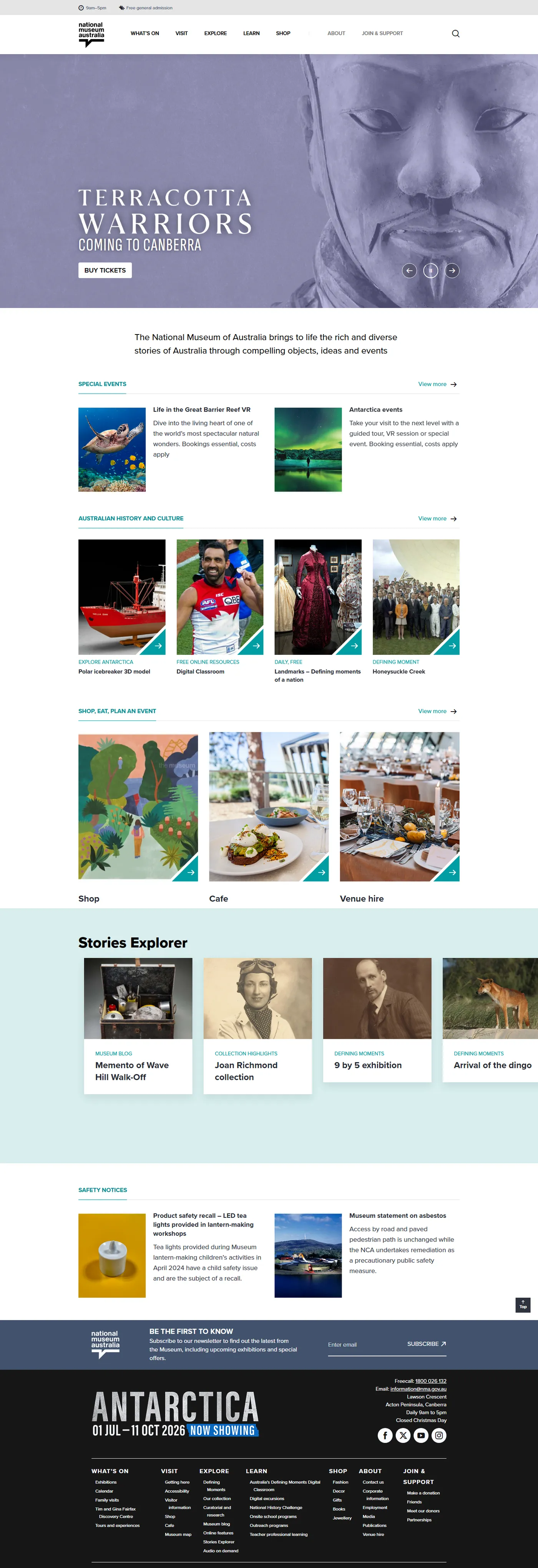
The Museum’s objects and exhibitions are more striking than anything a designer could draw around them, so the design gets out of the way. A dark grey and teal frame, a lot of white, and the exhibition photography doing the work. Opening hours and free admission sit above the logo on every page, because that was the question the old site’s search logs asked most.
Below the hero, the home page runs through what is on, the Museum’s own stories, Defining Moments, the Digital Classroom, the shop and the café, each one a row of tiles that authors fill from the content they already publish. That order has held since launch.
Thinking about something similar? Nathan reads every message and replies within a business day.Talk to Ladoo
What a Defining Moment has to carry
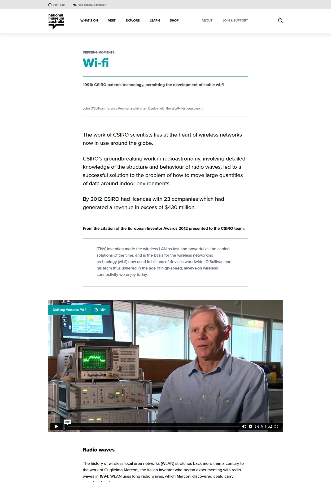
Defining Moments in Australian History is the Museum’s most visited online feature: hundreds of events, people and places, each one a page. The old pages were hand-built. The new template takes every one of them, and the migration scripts filled it 451 times.
 12345
12345- 1
The series, then the moment
Defining Moments above the title, so a visitor who arrived from a search knows where they are, and the Museum’s teal marks the series across the site.
- 2
The year and the one-line summary
A date and a sentence, structured fields rather than prose, so the same moment can appear on the timeline, in a filtered list and in a school resource.
- 3
The story in short
The curator’s summary, set large, for the reader who wants the gist. Everything below it is for the reader who wants more.
- 4
The media
Video, audio and collection images in a full-width frame. The content model treats media as a module, not an embed in a paragraph, so it survives a redesign.
- 5
The long read
Sub-headed sections for the student writing an essay, followed by related moments on the same topic, from the same place or for the same school year.
One page, three screens
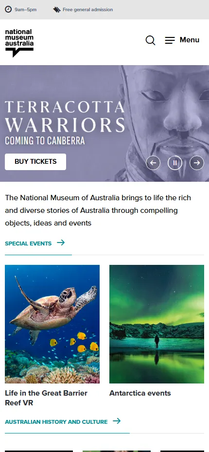
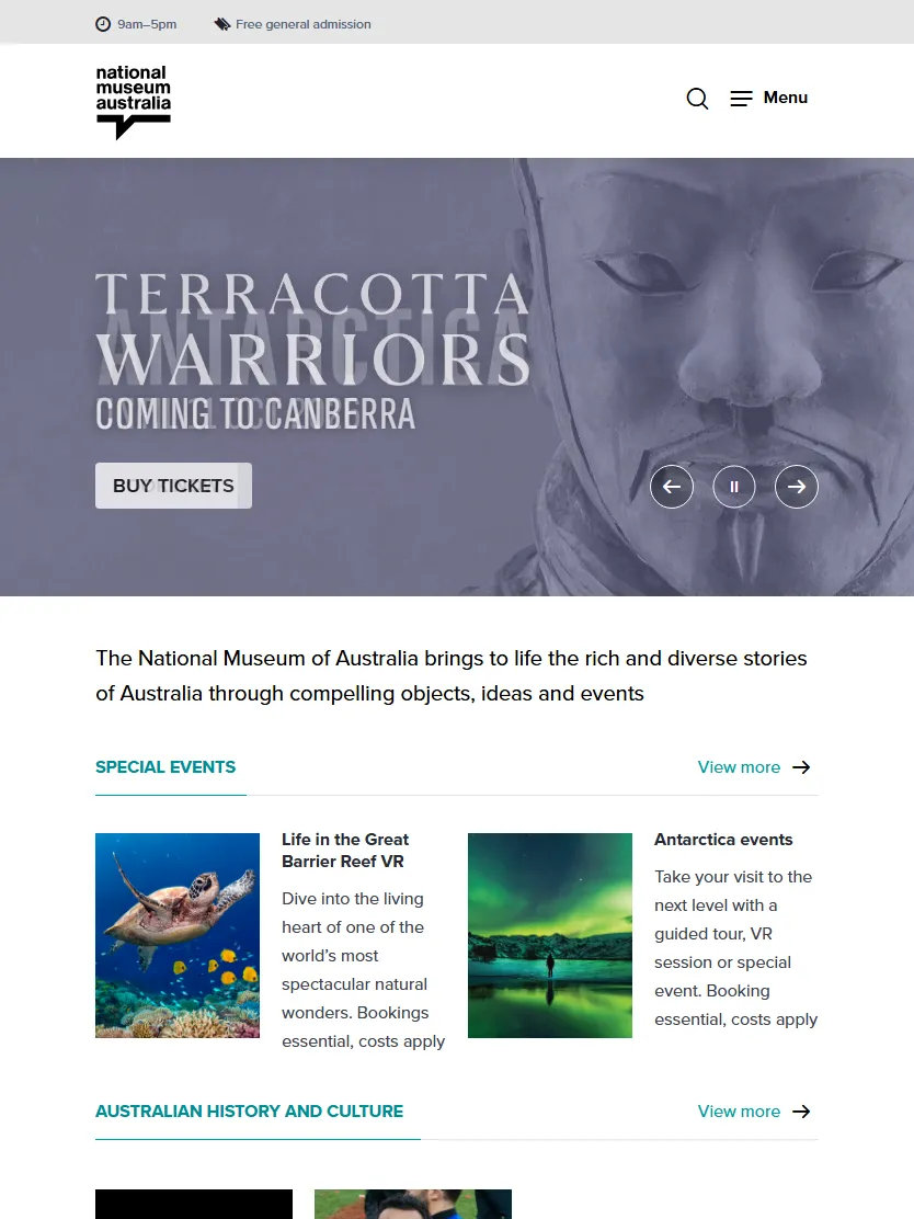
The design overview started with the screen sizes in the Museum’s analytics and set a grid that works from a small phone to a wide desktop, with the type scale, spacing and column rules written down for each. Every template was then designed at phone and tablet size as well as desktop, as the brief required.
The same home page, captured today at three widths. The tiles reflow from one column to two to four, the menu folds into a button on the phone, and the opening hours stay at the top. A visitor standing on Lawson Crescent gets the same answer as one at a desk.
Pick a screen. It cycles on its own until you do.
Wireframe, May 2018, beside the live page
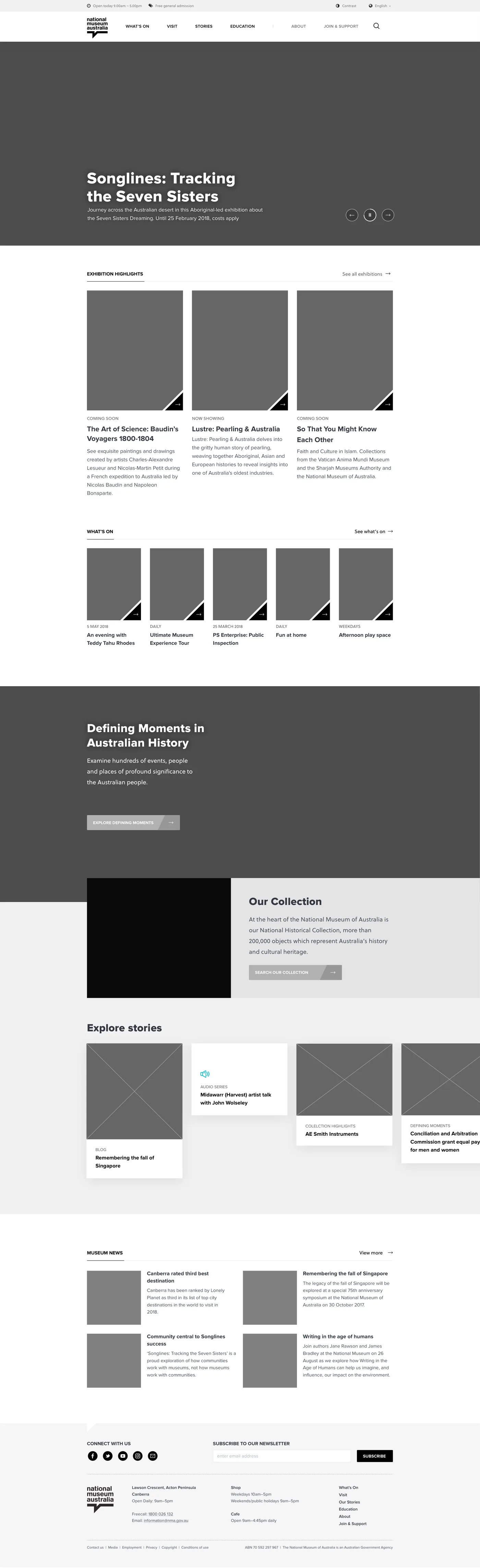
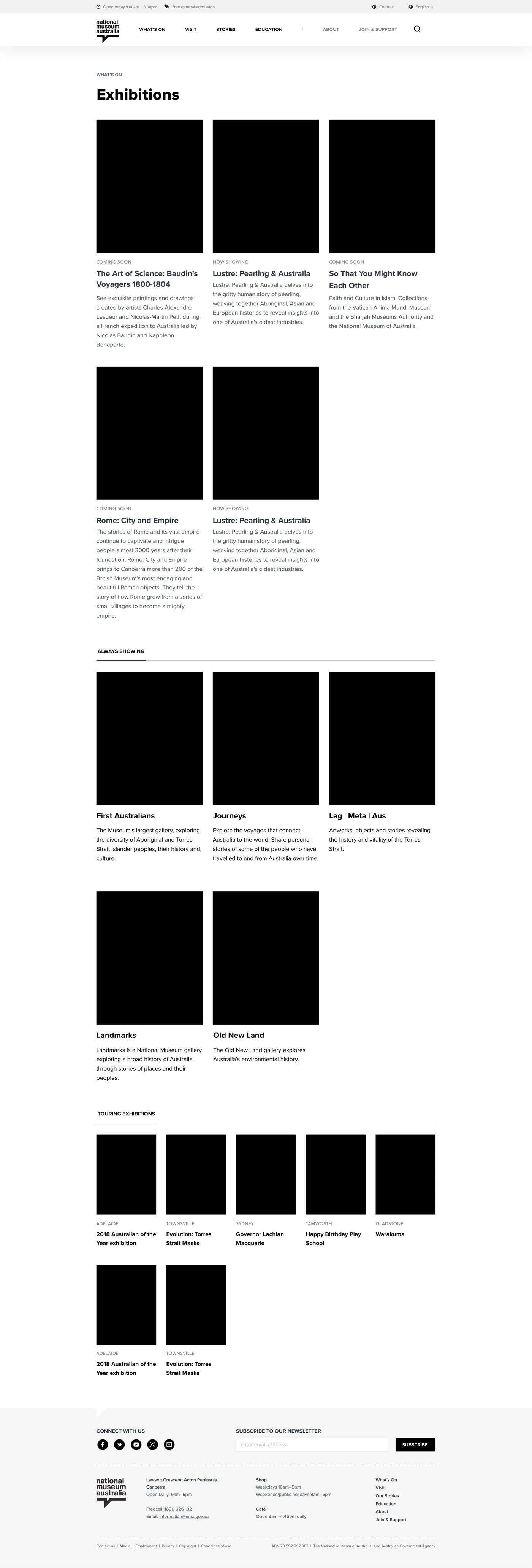
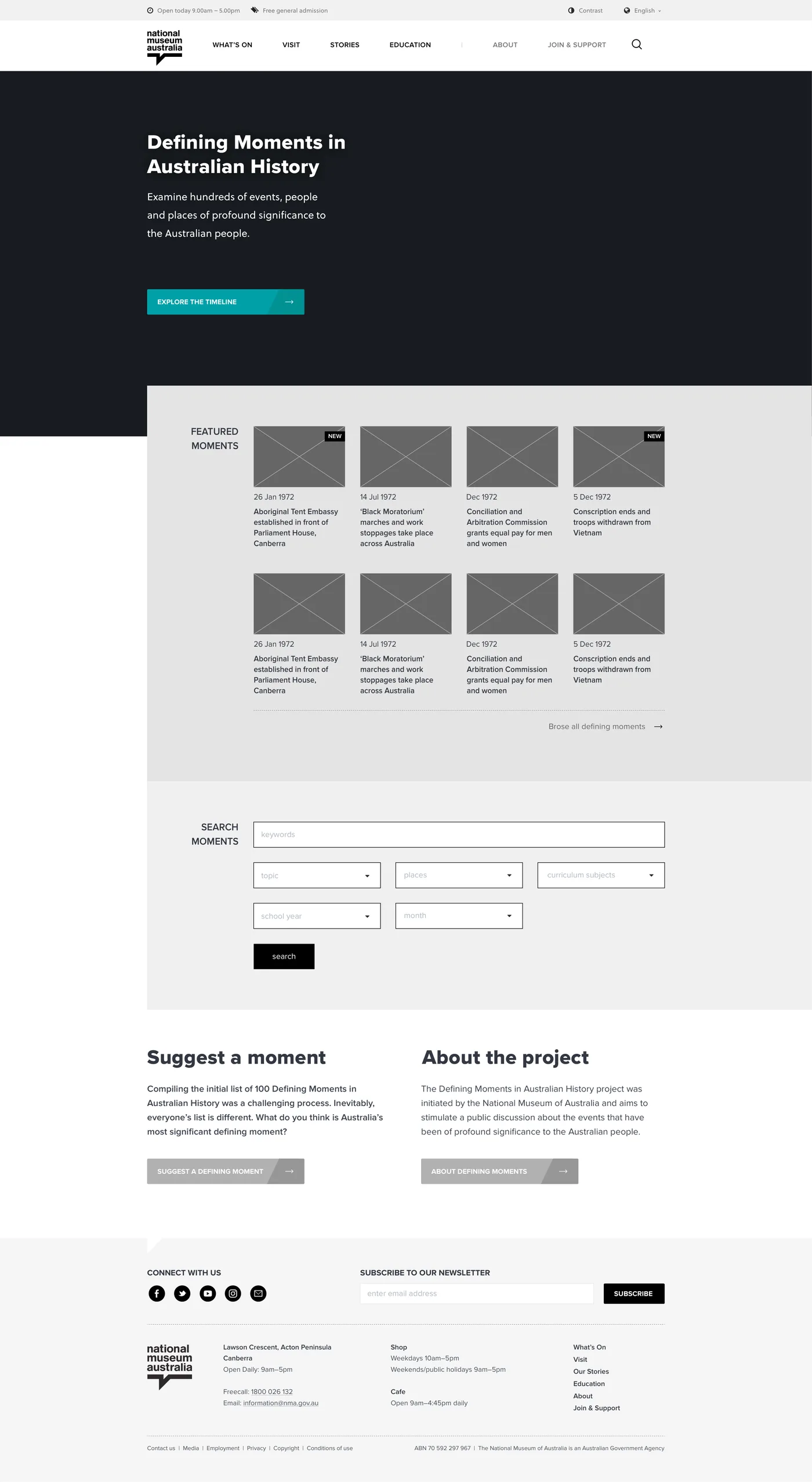
Ladoo wireframed the site in Illustrator and presented it in iterations, nineteen reviews between February and May 2018, before the visual design was applied. Here three of the final wireframes sit beside the live pages today. The structure held.
The home page. Hero, what’s on, Defining Moments, the collection, stories. The wireframe set the order and the live site kept it.
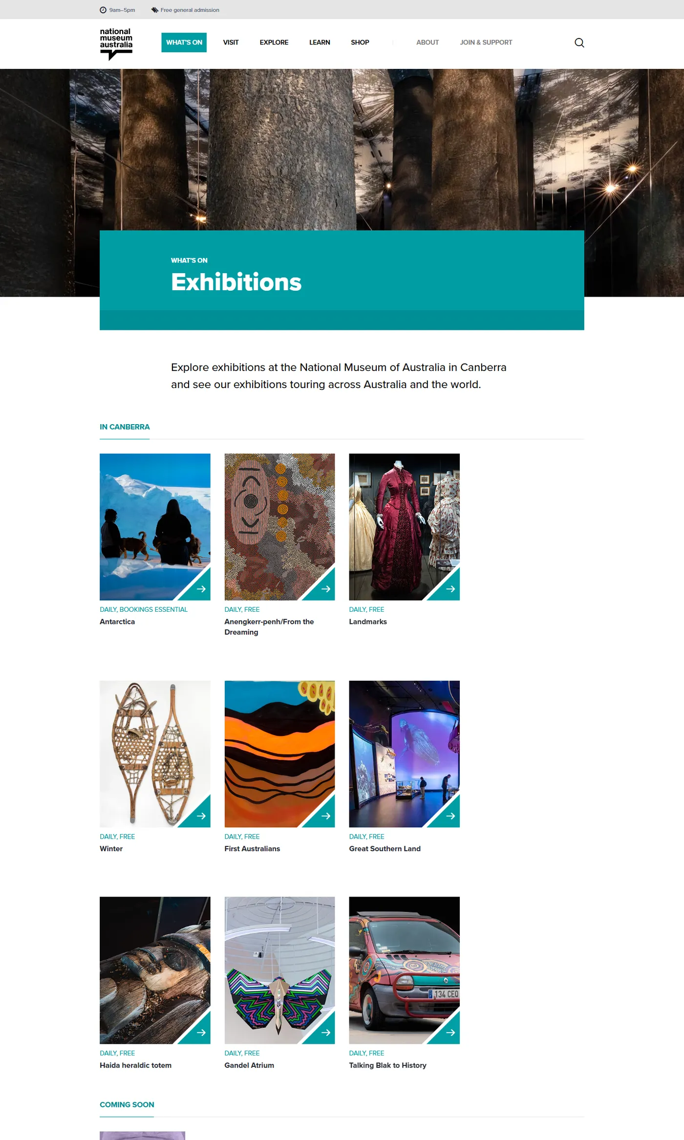
Exhibitions. Now showing, coming soon and touring as tiles, with past exhibitions as a list underneath.
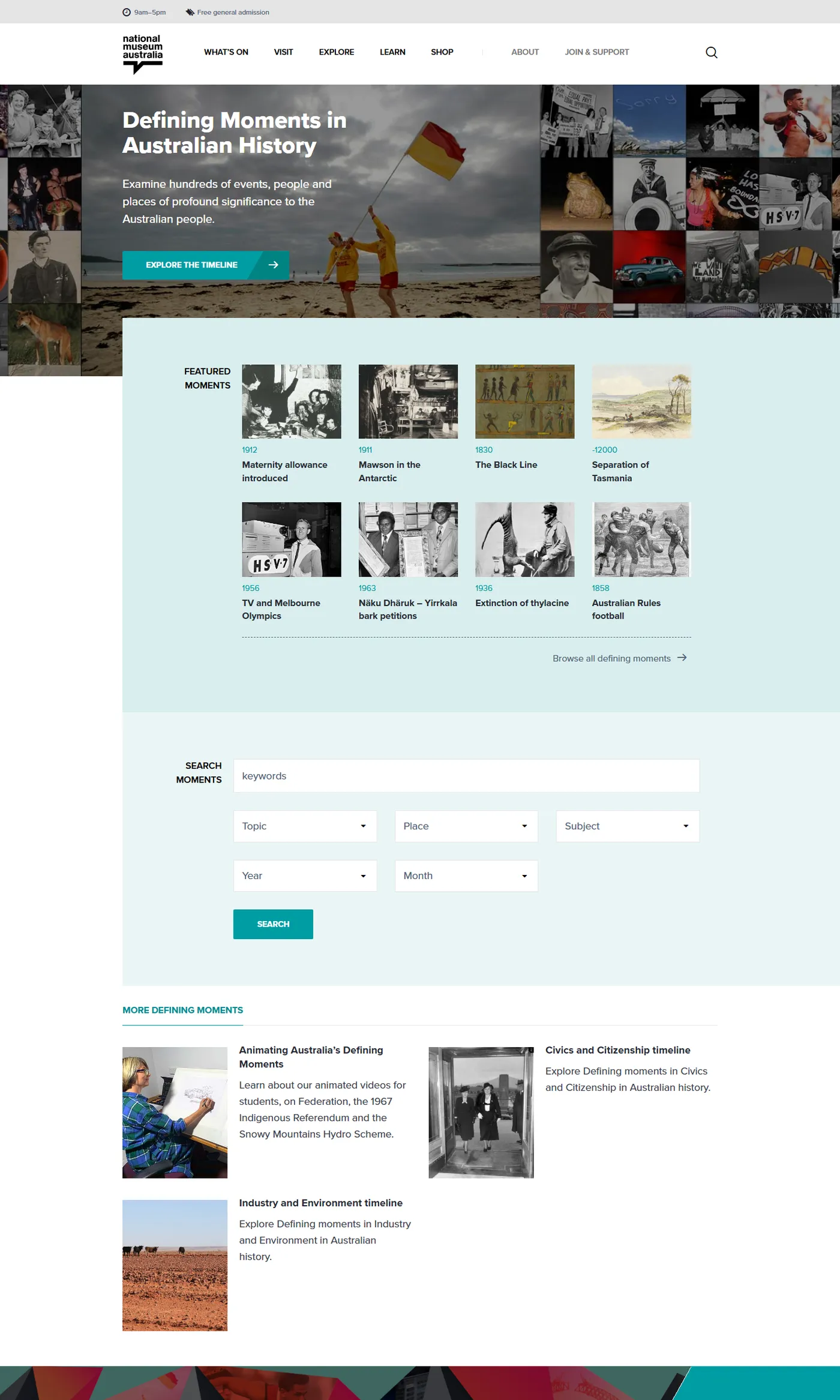
Defining Moments. A dark header, featured moments, then search by topic or place, by subject or by school year.
Five thousand pages, moved by script
The Museum audited every page on the old site and marked each one: migrate as it is, archive, or leave behind. Ladoo wrote the migration plan around that audit. Each bar is a section of the old site. The blue is what came across; the grey is what the Museum chose to let go.
The twelve largest sections of the May 2018 audit, which counted 5,530 pages in all. The blue is what the migration script could move unchanged. Pages with special layouts were moved and adapted by hand, which is how 5,084 pages ended up in scope and live by June 2018.
Two passes, every batch
A Ladoo script created the asset shells for the new structure with their metadata, then a second pass filled them with content and rewrote every link. Defining Moments and the audio archive, more than eight hundred pages between them, were migrated in bulk this way.
What a script cannot read
Pages with special layouts were moved by Ladoo content specialists, each one adapted to the new modules and checked against WCAG 2.0 AA. Reports for broken links and migrated assets ran after every batch.
A small sample, then the rest
Each batch began with a sample the Museum reviewed in a weekly migration meeting. Feedback went into the full batch, which the Museum’s own authors then checked section by section before sign-off.
Emergency updates, logged
Content on the old site was frozen for the scripted phase. Urgent changes went through the Museum’s project manager into a register, and were replayed on the new site in the week before launch.
A design framework built to outlast its launch
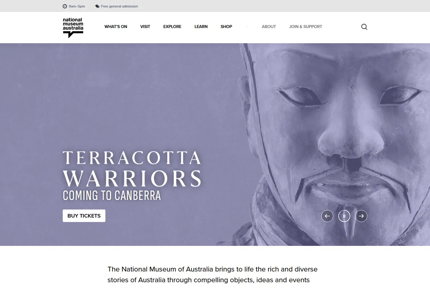
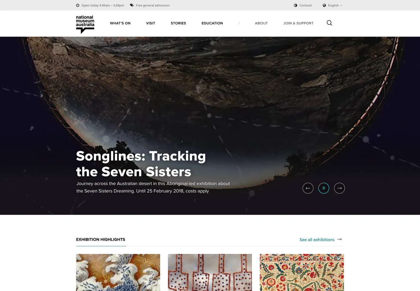
The home page was designed in May 2018 and the site went live the next month. Drag the handle: on the left is the design as presented, on the right is nma.gov.au today. The header, the grid, the type, the teal and the module library are the same. The exhibitions have changed, and two menu labels.
 Design, May 2018Live, 2026
- The header pattern: hours and free admission above the logo, the sections across, search at the end
- Six sections, two of them since renamed
- The responsive grid and the type scale, Proxima Nova and Soleil
- Dark grey and teal, with the collection carrying the colour
- The tile, card, listing and story modules authors build pages from
- Stage two in 2018 and 2019: online tours, the Collection Explorer, the map, the shop and library templates, Mkids
- Parallax story templates in 2019
- The Digital Classroom for teachers
- Convict Love Tokens, with 3D models, in 2022
- Every exhibition, event and Defining Moment published since
- The design was built to show the content, not to be looked at, so it does not date with fashion
- Pages are assembled from modules with structured fields, so new kinds of content get a new module, not a new site
- The framework was written down: breakpoints, spacing, type and column rules for each screen size
- The same team has looked after it every year, so change has been incremental
Many public sites are rebuilt twice in eight years. This one has been added to.
Stage one was the beginning
Ladoo has worked with the Museum every year since the site went live, on the second stage of the rebuild, on new ways to tell stories, and on the search that underneath all of it.
Stage two
The deeper content types the first stage had parked: online tours that group content by theme, the Collection Explorer integration, an interactive map, the shop and library templates, and the Mkids modules for children.
Story templates
A parallax story template for the Museum’s long-form features, so a curator can publish a scrolling, full-bleed story without a developer.
Convict Love Tokens
A site for the Museum’s collection of 314 tokens engraved by convicts for the people they left behind: a timeline, a flip view of each token, and 3D models to turn in the browser.
Search on Elasticsearch
Site search runs on Elasticsearch on AWS, which Ladoo recommended in the proposal and has operated since: architecture, upgrades, backups and monitoring around the clock, renewed each year on a work order.
Support packs
Improvements, social sharing, member promotions, animated maps and the post-launch amendments every busy site needs, delivered through support packs the Museum draws down as it goes.
Six layers, one team
Every public website is a stack. These are the layers Ladoo designed and built for the Museum, from the responsive grid to the search index that answers every query.
From the grid a visitor sees to the index that finds the page.Designed and built by one Ladoo team on Squiz Matrix
- InterfaceA responsive design framework from 320 pixels up, with the collection as the picture on every page
- Content modelPages built from modules in Squiz Matrix, so authors assemble a page rather than code one
- SearchElasticsearch on AWS, run and upgraded by Ladoo every year since 2018
- MigrationScripts that rebuilt five thousand pages, with the content of each one mapped to the new modules
- StoriesDefining Moments, audio on demand, story templates and the Convict Love Tokens site, each on the same framework
- AccessibilityWCAG 2.0 AA, in the migration as well as the build
From proposal to launch in two-week iterations
Discovery, November 2017
A crawl and readability review of the old site, a comparative review of museum sites, and the design workshop on first impressions, design values, typefaces and colour, with the Museum’s team in the room.
Structure and wireframes
The information architecture to draft nine, then wireframes for every template in Illustrator, presented and revised in nineteen iteration reviews between February and May 2018.
Visual design
Design exploration in rounds, a design overview with the palette, type and responsive framework in February, and detailed designs at phone, tablet and desktop size through to June.
Build, migrate, launch
Squiz Matrix templates and modules built in two-week iterations, the migration in eight batches with weekly reviews, four rounds of acceptance testing, and go-live at the end of June 2018.
The questions we get asked about this project
Did the Museum have to rewrite its content?
No. The migration moved content as it was, into the new modules, and the Museum’s audit decided what to leave behind. Rewriting was out of scope by design, so the launch did not wait on it. Authors have been improving pages in Squiz Matrix ever since.
Why Elasticsearch, and why does Ladoo run it?
Because the Museum’s content is deep and the search had to understand it: thousands of pages, audio series, collection records and Defining Moments, with filters by topic and school year. Ladoo recommended Elasticsearch in the proposal and has run it on AWS for the Museum since 2018, so the Museum does not need to.
How did five thousand pages move in eight months?
By scripting what could be scripted and reviewing in small batches. Large sections that shared a template, such as Defining Moments and the audio archive, went across in bulk. Pages with special layouts were handled by hand. A weekly migration meeting kept the Museum’s authors ahead of each batch.
Would this work for us?
If your organisation has a large, old site with content worth keeping, a design that needs to let the content speak, and a deadline, this is the shape. Talk to Nathan and he will tell you honestly.

- Client
- National Museum of Australia
- Site
- nma.gov.au
- Sector
- Arts and culture
- Platform
- Squiz Matrix, now Squiz DXP
- What we did
Ladoo ran discovery, designed the structure and the interface, built the site on Squiz Matrix and migrated the content. The Museum owns and publishes the content, and Ladoo runs the search and supports the site.
What shipped
- A responsive site on Squiz Matrix with a six-section structure and taxonomies that let one page live in many lists
- A design workshop, nineteen wireframe reviews and a visual design built around the collection
- Templates for the home page, what’s on, events, exhibitions, visit, collection, education, Defining Moments and search
- 5,084 pages migrated by script and by hand in eight reviewed batches, live by the end of June 2018
- Site search on Elasticsearch on AWS, run by Ladoo every year since 2018
- Stage two, story templates, the Convict Love Tokens site and support packs in the years since

Talk to Nathan about your site.
Nathan runs Ladoo and reads every message himself. Tell him what the site has to do and what is in the way, and within a business day he will tell you what he would do first and whether we are the right fit.