As a Sydney resident, I want to see dam levels during a spill so that I feel informed.
The three storage figures lead the home page. Warragamba has its own, one tap from anywhere.
Work WaterNSW
WaterNSW · Utilities and servicesWaterNSW looks after the dams and rivers of New South Wales. Most days its website is quiet. On the day it rains hard, it is the most important page in the state for a lot of people at once. We built it for that day.
WaterNSW captures, stores and delivers bulk water for the state, so its website serves two very different crowds. Licence holders come to trade water and pay accounts. The public comes for the dams, and above all to see how full they are.
The old site treated them as one crowd and organised itself like the business: dams under Water Operations, education under Water Quality, news buried in About Us. Two thirds of all page views were on the dam and storage pages, and only one visit in twenty began at home. The architecture had to be designed around its busiest hour, not its average one.
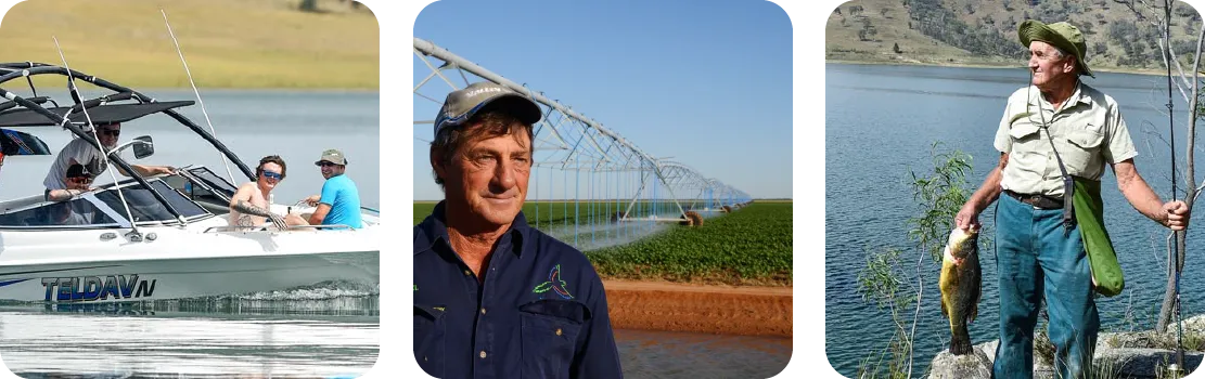
Transient, mostly on phones, often outdoors. They want to know whether the dam is open, what they can do there and how full it is. They arrive in waves, and the biggest wave is a wet weekend.
Around forty thousand customers get a bill from WaterNSW: farmers, irrigators, councils and industry. They know what they need, come back often and want to get to the right portal without a tour of the organisation. In the analytics theirs was the one part of the site that did not move with the weather.
March 2021, from the analytics we reviewed in discovery. The sky changes, the rain starts, and the people arriving at the site change with it. The line shows the shape of that week, not to scale.
Licence holders log in to trade and pay. A few families plan a weekend at Lake Burrendong. Quiet, steady, and the customer service pages tick along at the same pace all year.
Sydney starts checking Warragamba, and people everywhere check the dam nearest them, mostly from a phone. On the old site the figure they wanted sat behind a menu called Water Operations.
Nine times an average day. Over six days the site saw more sessions than in any other full month that year. The live figure, a clear route to it and a site that stays calm under the load are the whole job. That is the moment the new architecture was shaped for.
Storage level, recent rainfall and high-level usage come straight from WaterNSW back-end systems into Squiz Matrix. Nobody at WaterNSW updates a dam level by hand, and nobody has to remember to.
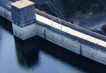 Avon Dam
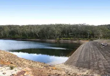 Blue Mountains Dam
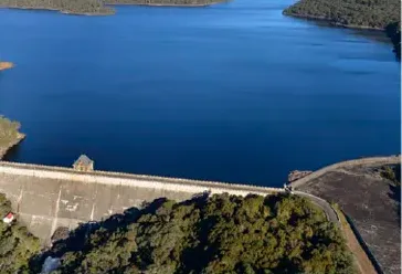 Cataract Dam
The live data page, rebuilt here in HTML from a capture so the figures can count. The values are from the day of the capture.
That matters most on the day it matters most. When a dam is close to spilling, the figure people are refreshing is the same one the operations team is watching, and the content team can spend a wet week on the messages that need a human.
If you hold data the public wants in a hurry, the website should read it, not copy it. Matrix carries that integration without a separate application in front of it.
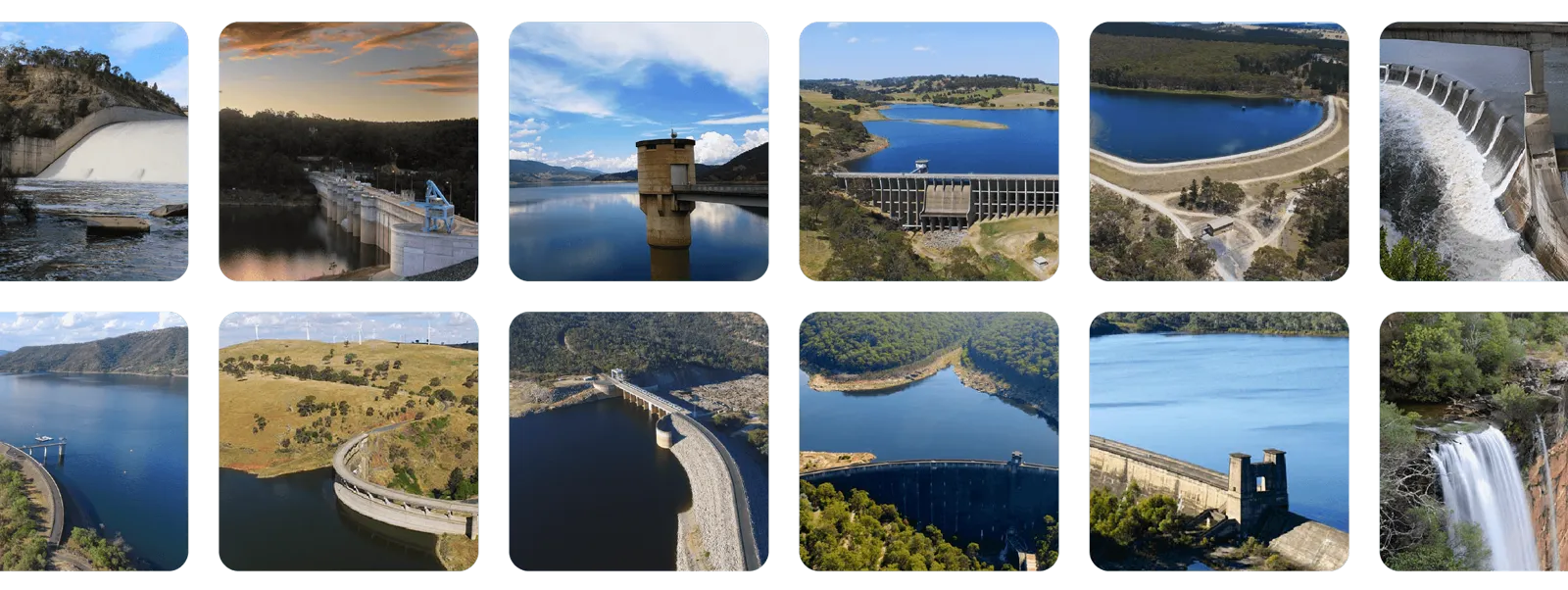
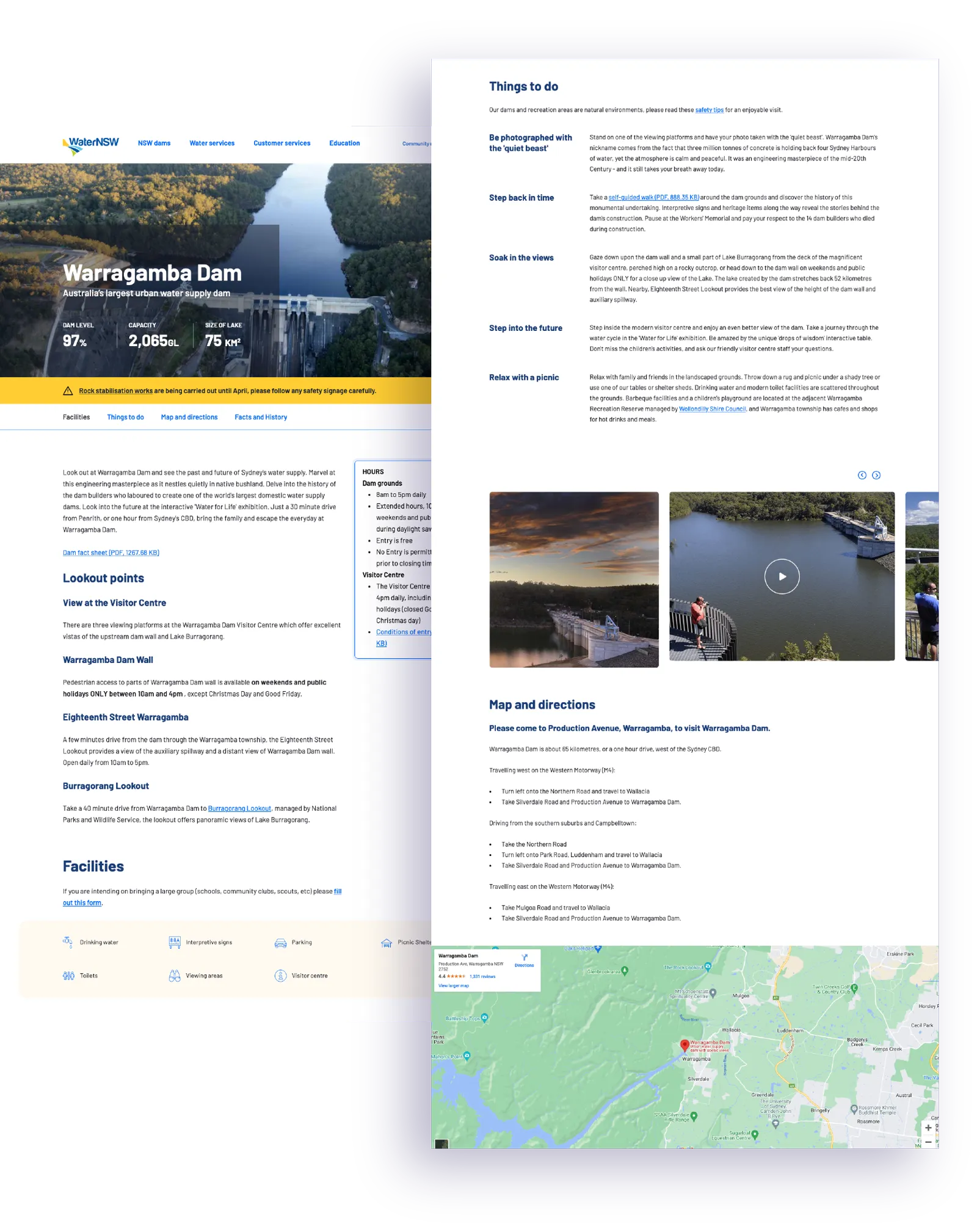

The old dams content was spread across several pages per dam and read like an asset register. The new structure gives each dam one page with what a transient, mostly mobile audience needs: how to get there, what you can do, what is open, and the live figures.
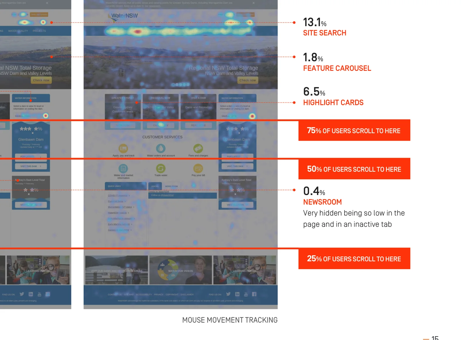
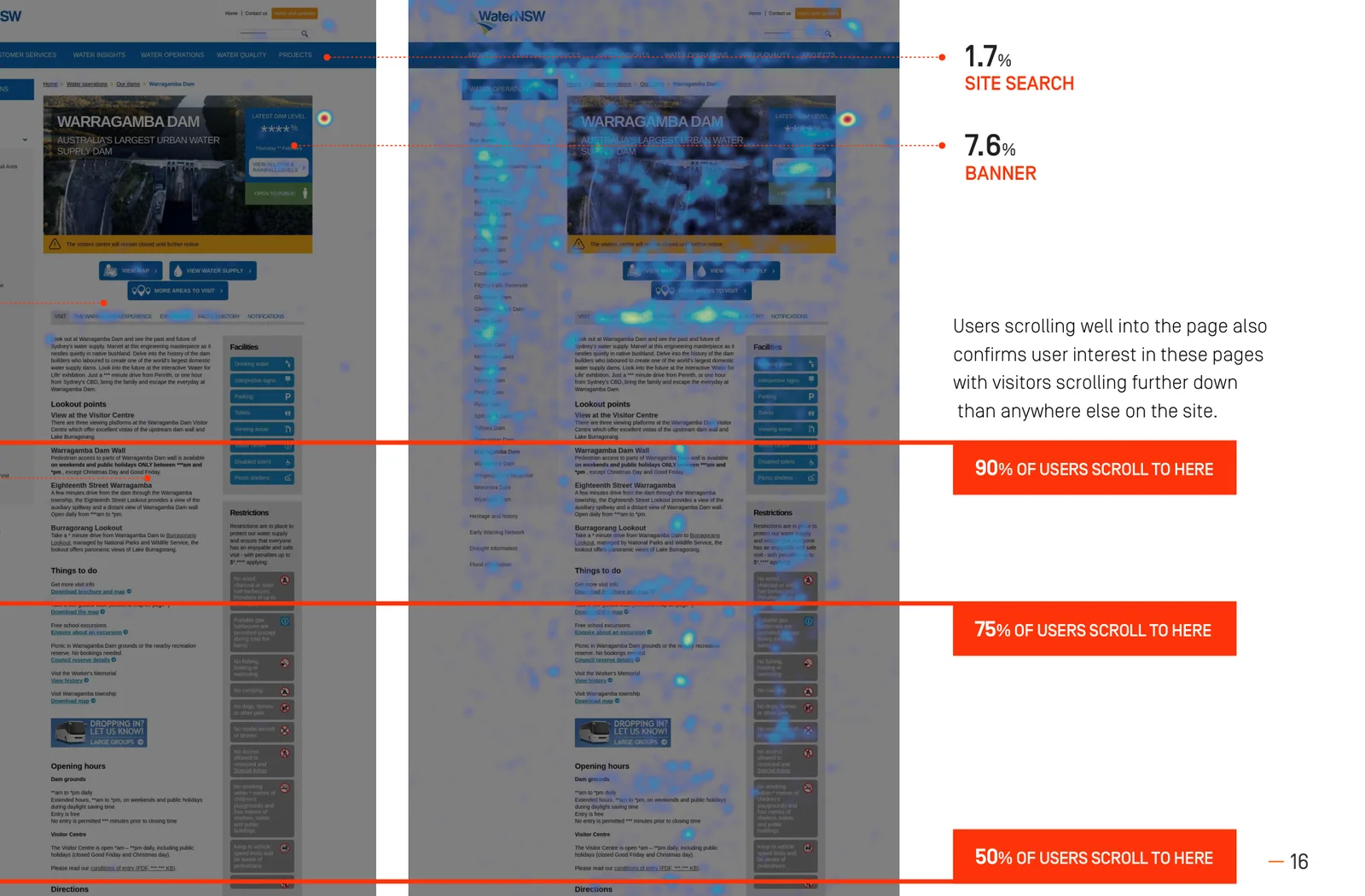
The heatmaps told us how much people cared. Visitors scrolled further on the dam pages than anywhere else on the site, and the photo gallery at the bottom drew a fifth of all clicks even though only a third of visitors ever reached it. The photos were not decoration. They were the content.
The same page serves the irrigator who checks the level every morning and the family deciding whether to tow the boat up on Saturday. It was written for both.
Before design, every dam page on the old site was audited: capacity, catchment, whether it was open, facilities, restrictions, lookouts and hours. That audit and the user stories from discovery gave us a short list of questions every dam page must answer. The page is built in that order.
12345Dam level, capacity and the size of the lake sit under the name, with an open or closed flag and any closure notice. Half of the visits are answered right there, and the level is live from WaterNSW systems.
Hours, facilities and restrictions, split into what WaterNSW manages and what other agencies manage. Written for someone already in the car.
Boating, fishing, camping, picnics, the visitor centre. Each one a plain statement of what is allowed at this dam, with the photos people were hunting for on the old site.
Where it is and how to get there from the nearest big town, on a map that works on a phone.
What it does, who it supplies and how it was built, for the people who want to stay a while. Last on purpose.
Thinking about something similar? Nathan reads every message and replies within a business day.Talk to Ladoo
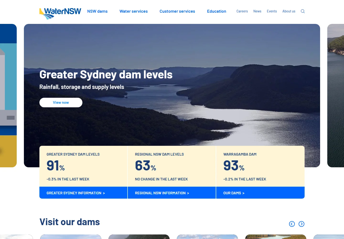
Greater Sydney's storages sat at 91% when we captured this page on 7 Oct 2026. The live site answers the question in one glance from the home page, which is where most people start when the rain is on the roof.
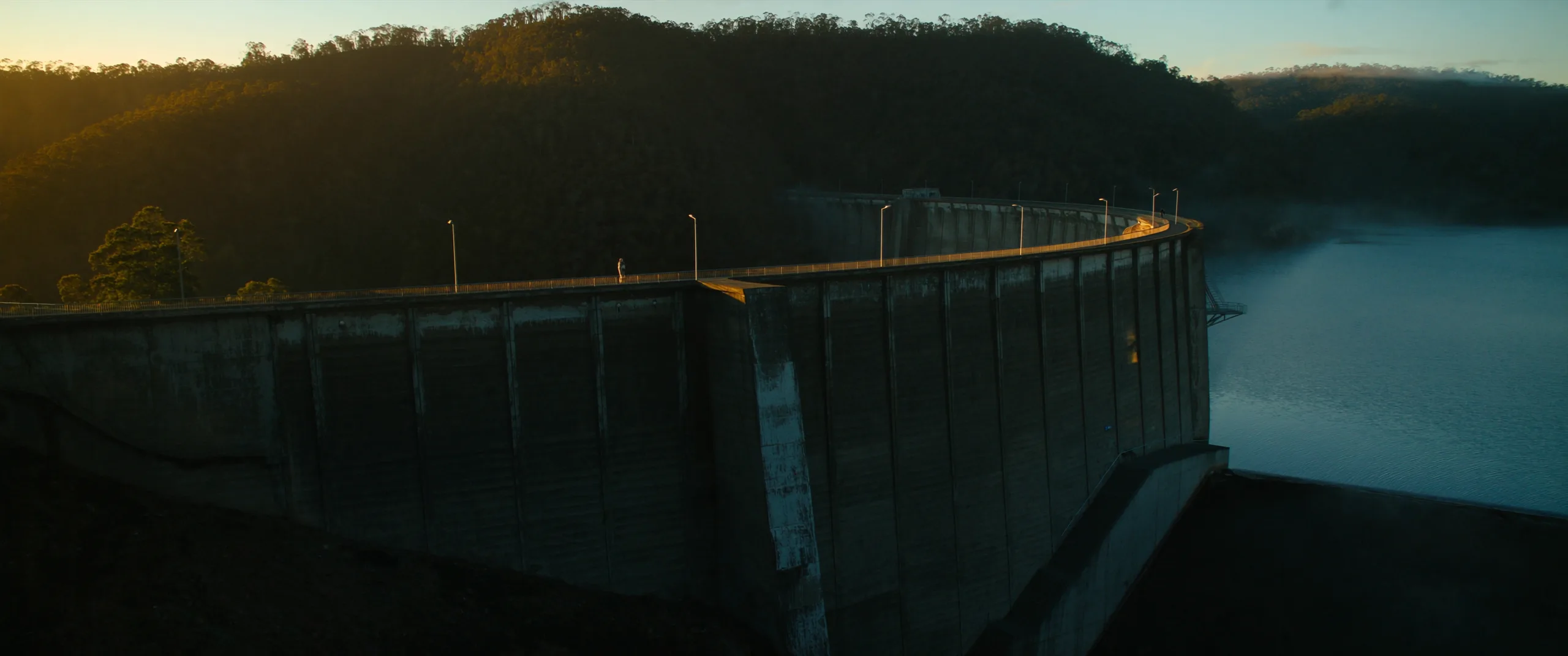
Design started in the workshops, not in a drawing tool. Twelve WaterNSW stakeholders placed the new site between ten pairs of words. Three came out on top and became the brief for every screen: friendly, fluid, contemporary. Ease of navigation and plain language were the asks underneath them.
As a Sydney resident, I want to see dam levels during a spill so that I feel informed.
The three storage figures lead the home page. Warragamba has its own, one tap from anywhere.
As a boatie, I want to know if the boat ramp is open so that I can go fishing.
An open or closed flag at the top of every dam page, with facilities split by who manages them.
As a farmer, I want to order and trade water so that I can run my farm.
The "I want to" on-ramp, with the rules explained first and a straight line into the portal.
As a teacher, I want resources aligned to the syllabus so that I can engage my students.
Education became one of the four primary sections, instead of a corner of Water Quality.
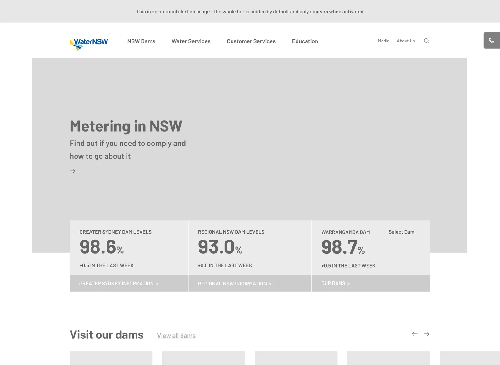
The home page. Three storage figures lead, the dams come next, customer services after. The wireframe set the order and the live site kept it.
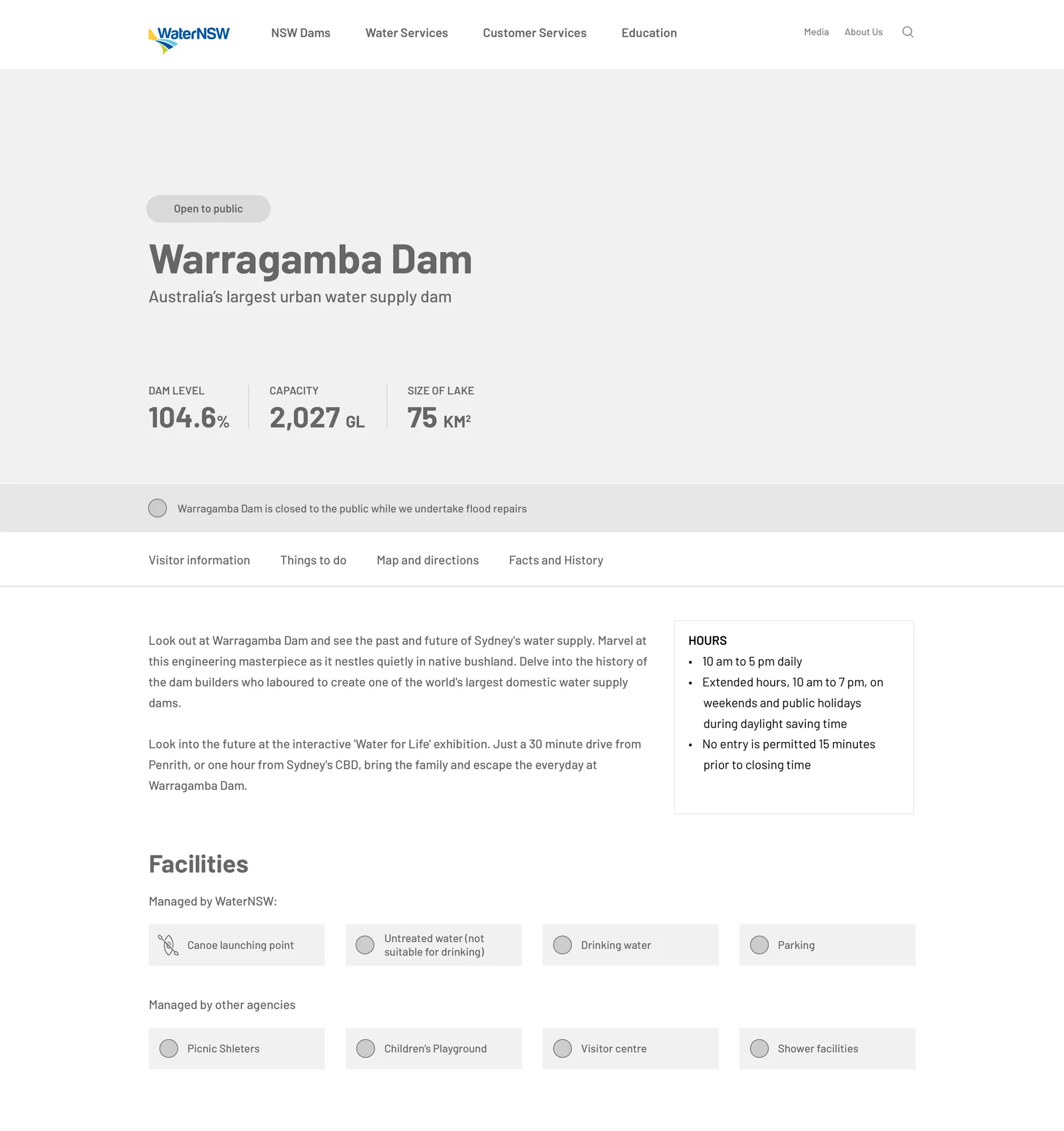
The dam page. Open flag, name, then the level and capacity with the size of the lake, and the closure notice and the four visitor tabs under them.
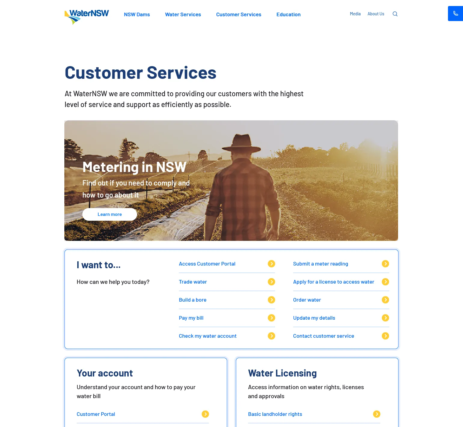
Customer services. The portal and billing tiles up top with the contact route, then the "I want to" list, exactly as drawn.
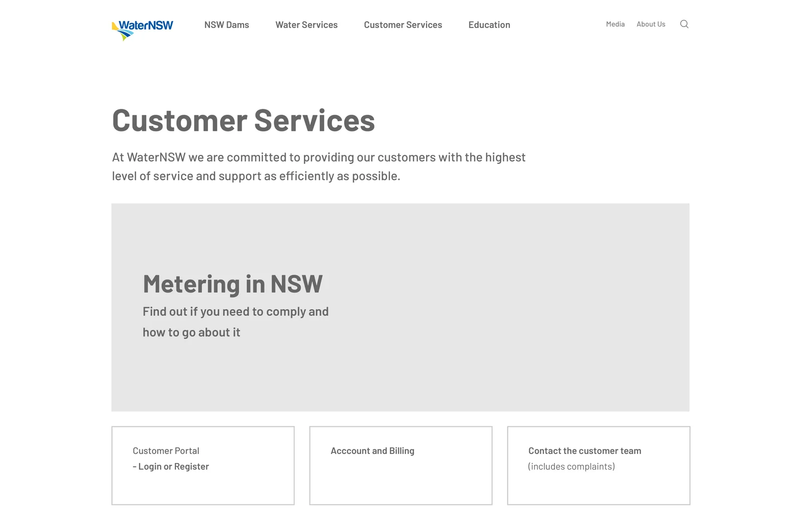
The workshops were blunt about the old licensing section: too complex, no wayfinding. The customer service area was rebuilt as an on-ramp with an "I want to" list at the top. Each entry is a task a real customer described in discovery. Behind each one is the support content and a direct route into the system that completes the task.
Daily orders set the releases from the dams. Trades move allocation between licences. Both have their rules in one place and a straight line into the portal.
Access licences and approvals, plus basic landholder rights, explained before the form rather than inside it.
Bills, direct debit and what the charges mean, written for a customer who opens the site once a quarter.
Metering and reporting obligations with dates and the portal link, so compliance is a five-minute job.
Drillers' licences and approvals, with the water register, one of the tasks the workshops named as hardest to find on the old site.
The customer portal, with a route from every task page, so the site prepares the customer and the portal does the transaction.
NSW dams, water services, customer services and education are the four doors on the home page, with media and about us behind them. The three storage figures lead the page because, in the year before the rebuild, two thirds of all page views were people looking for them.
A public visitor never has to understand how WaterNSW is structured. A customer never has to scroll past recreation content to find the trading portal. Both groups get a site that seems to have been built just for them, which is the point.
Every public website is a stack. These are the layers Ladoo designed and built for WaterNSW, from the dam pages people see down to the data feed behind them.
From the dam page down to the data feed.Designed and built by one Ladoo team on Squiz Matrix
A content audit of the old site, a year of analytics and heatmaps, and two online workshops with WaterNSW stakeholders on goals, on hopes and fears, on audiences and on what worked and what did not. Twelve people set the design values: friendly, fluid, contemporary.
A site of around three hundred pages across six departmental sections, rationalised into six audience-facing ones with nothing more than four levels deep. Three revisions, reviewed with the WaterNSW team.
The home page, the dam page, the storage data page and the customer on-ramp first, because they do the most work. A module kit grew out of them.
The site, the module kit, the data integration and site search, built so WaterNSW authors could take the content over on day one.
No. Those are WaterNSW systems. Ladoo designed and built the public site that explains them and gets customers into them with the least friction, and integrated the water data they share.
WaterNSW is a government corporation with a content team that needs to publish without a developer, strict accessibility requirements and a lot of structured content. Matrix handles all three, and the data integration sits inside it rather than in a separate application.
Ladoo has worked on Squiz Matrix since 2010, so there is very little we have not seen it do.
WaterNSW looks after the content with its own team. New modules, new integrations and improvements are shipped as the organisation needs them. We treat the site as a product that keeps moving, not a project that ended on launch day.
If you serve a broad public and a smaller group of customers from the same site, and your content team wants control, the shape of this work transfers well. Councils, regulators and utilities are the closest fit. Talk to Nathan and he will tell you honestly.
Councils during a flood, universities on offer day, health services during an outbreak. Most public organisations have a day when the website is the front line. Here is what the WaterNSW work taught us about building for it.
Work out which page people run to on the bad day, and make it one tap from the home page on a phone. Then look at what your most prominent element actually earns. WaterNSW's carousel earned almost nothing.
If the figure lives in a back-end system, integrate it. Hand-keyed numbers are wrong exactly when being right counts.
During an event the content team needs to publish messages in minutes. Modules they arrange themselves in Matrix make that possible without a developer in the loop.

Ladoo ran discovery, designed the information architecture and the interface, and built the site on Squiz Matrix with the data integration to WaterNSW systems. WaterNSW looks after the content with its own team.
Nathan runs Ladoo and reads every message himself. Tell him what the site has to do and what is in the way, and within a business day he will tell you what he would do first and whether we are the right fit.